Research

As a university spin-off, research is in our DNA.

Our founders and our team have a long track record of developing and publishing cutting-edge visualization methods, and we continue to do research and publish it at datavisyn!  Our basic research work is also often funded by public agencies, which we gratefully acknowledge. 

BioInsight App Screenshot

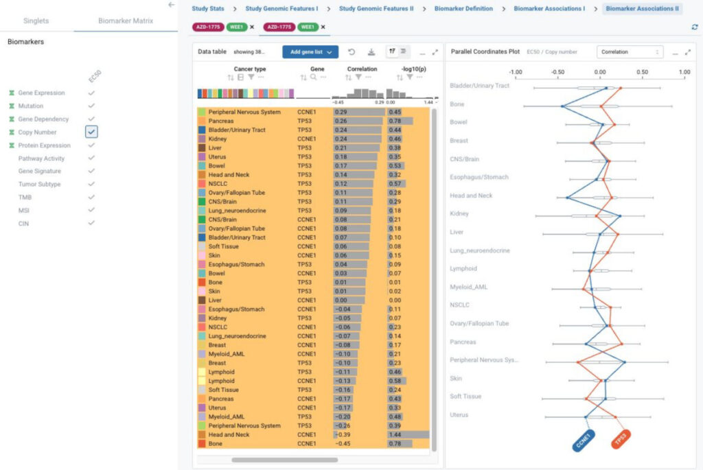
BioInsight, a customized application for biomarker exploration and discovery

Brian Frost, Hansen Han, Martin Weigl, Dale Erikson, Oltion Champari, Dominic Girardi, Daniela Moitzi, Lin Tang. Schrödinger Inc., San Diego, CA, Schrödinger Inc., New York, NY, datavisyn GmbH, Linz, Austria, 2025.

Abstract

BioInsight is a unique solution to integrate large-scale pharmacogenomic data that enables biomarker exploration, validation, and discovery across preclinical models and drug screening studies from public and internal resources.

The application uses a data schema that integrates drug screening study, gene-level multi-omics biomarker and heterogeneous composite genomic biomarkers, including pathway activity score, gene signature, TMB, CIN, MSI and molecular tumor subtypes. This sets up the foundation for future data growth in both the genomic biomarker and screening study spaces.

This project incorporates state-of-the-art visualization technologies with Ordino for flexible data and plot selection, and easy data comparison across screening studies and model systems.

Read more

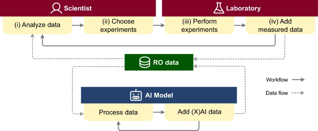
CIME4R: Exploring iterative, AI-guided chemical reaction optimization campaigns in their parameter space

Christina Humer, Rachel Nicholls, Henry Heberle, Moritz Heckmann, Michael Pühringer, Thomas Wolf, Maximilian Lübbesmeyer, Julian Heinrich, Julius Hillenbrand, Giulio Volpin, Marc Streit. Journal of Cheminformatics, 16(51), 2024.

Abstract

Chemical reaction optimization (RO) is an iterative process that results in large, high-dimensional datasets. Current tools allow for only limited analysis and understanding of parameter spaces, making it hard for scientists to review or follow changes throughout the process. With the recent emergence of using artificial intelligence (AI) models to aid RO, another level of complexity has been added. 

Helping to assess the quality of a model’s prediction and understand its decision is critical to supporting human-AI collaboration and trust calibration. To address this, we propose CIME4R—an open-source interactive web application for analyzing RO data and AI predictions. CIME4R supports users in (i) comprehending a reaction parameter space, (ii) investigating how an RO process developed over iterations, (iii) identifying critical factors of a reaction, and (iv) understanding model predictions. This facilitates making informed decisions during the RO process and helps users to review a completed RO process, especially in AI-guided RO. CIME4R aids decision-making through the interaction between humans and AI by combining the strengths of expert experience and high computational precision. We developed and tested CIME4R with domain experts and verified its usefulness in three case studies. Using CIME4R the experts were able to produce valuable insights from past RO campaigns and to make informed decisions on which experiments to perform next. We believe that CIME4R is the beginning of an open-source community project with the potential to improve the workflow of scientists working in the reaction optimization domain.

Read more

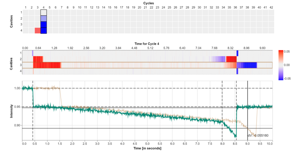
Visualizing and Monitoring the Process of Injection Molding

Christian A. Steinparz, Thomas Mitterlehner, Bernhard Praher, Klaus Straka, Holger Stitz, Marc Streit. Electronic Imaging, 35(1): 403-1 - 403-7, 2023.

Abstract

In injection molding machines the molds are rarely equipped with sensor systems. The availability of non-invasive ultrasound-based in-mold sensors provides better means for guiding operators of injection molding machines throughout the production process.

However, existing visualizations are mostly limited to plots of temperature and pressure over time. In this work, we present the result of a design study created in collaboration with domain experts. The resulting prototypical application uses real-world data taken from live ultrasound sensor measurements for injection molding cavities captured over multiple cycles during the injection process. Our contribution includes a definition of tasks for setting up and monitoring the machines during the process, and the corresponding web-based visual analysis tool addressing these tasks. The interface consists of a multi-view display with various levels of data aggregation that is updated live for newly streamed data of ongoing injection cycles.

Read more

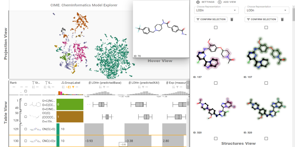
ChemInformatics Model Explorer (CIME): exploratory analysis of chemical model explanations

Christina Humer, Henry Heberle, Floriane Montanari, Thomas Wolf, Florian Huber, Ryan Henderson, Julian Heinrich, Marc Streit. Journal of Cheminformatics, 14(21), 2022.

Abstract

The introduction of machine learning to small molecule research– an inherently multidisciplinary field in which chemists and data scientists combine their expertise and collaborate – has been vital to making screening processes more efficient. In recent years, numerous models that predict pharmacokinetic properties or bioactivity have been published, and these are used on a daily basis by chemists to make decisions and prioritize ideas. 

The emerging field of explainable artificial intelligence is opening up new possibilities for understanding the reasoning that underlies a model. In small molecule research, this means relating contributions of substructures of compounds to their predicted properties, which in turn also allows the areas of the compounds that have the greatest influence on the outcome to be identified. However, there is no interactive visualization tool that facilitates such interdisciplinary collaborations towards interpretability of machine learning models for small molecules. To fill this gap, we present CIME (ChemInformatics Model Explorer), an interactive web-based system that allows users to inspect chemical data sets, visualize model explanations, compare interpretability techniques, and explore subgroups of compounds. The tool is model-agnostic and can be run on a server or a workstation.

Read more

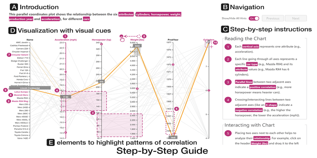
Comparative Evaluations of Visualization Onboarding Methods

Christina Stoiber, Conny Walchshofer, Margit Pohl, Benjamin Potzmann, Florian Grassinger, Holger Stitz, Marc Streit, Wolfgang Aigner. Visual Informatics, 6(4): 34-50, 2022.

Abstract

Comprehending and exploring large and complex data is becoming increasingly important for users in a wide range of application domains. Still, non-experts in visual data analysis often have problems with correctly reading and interpreting information from visualizations that are new to them. To support novices in learning how to use new digital technologies, the concept of onboarding has been successfully applied in other fields and first approaches also exist in the visualization domain. 

However, empirical evidence on the effectiveness of such approaches is scarce. Therefore, we conducted 3 studies: 

1) Firstly, we explored the effect of vis onboarding, using an interactive step-by-step guide, on user performance for four increasingly complex visualization techniques. We performed a between-subject experiment with 596 participants in total. The results showed that there are no significant differences between the answer correctness of the questions with and without onboarding. Furthermore, participants commented that for highly familiar visualization types no onboarding is needed. 

2) Second, we performed another study with MTurk workers to assess if there is a difference in user performances on different onboarding types: step-by-step, scrollytelling tutorial, and video tutorial. The study revealed that the video tutorial was ranked as the most positive on average, based on sentiment analysis, followed by the scrollytelling tutorial and the interactive step-by-step guide. 

3) For our third study with students, we gathered data on users’ experience in using an in-situ scrollytelling for the VA tool. The results showed that they preferred scrollytelling over the tutorial integrated into the landing page. In summary, the in-situ scrollytelling approach works well for visualization onboarding and a video tutorial can help to introduce interaction techniques.

Read more

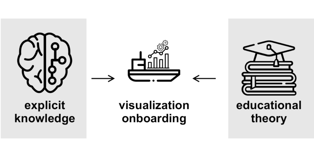
Visualization Onboarding Grounded in Educational Theories

Christina Stoiber, Markus Wagner, Florian Grassinger, Margit Pohl, Holger Stitz, Marc Streit, Benjamin Potzmann, Wolfgang Aigner. Springer, pp. 139-164, 2022.

Abstract

The aim of visualization is to support people in dealing with large and complex information structures, to make these structures more comprehensible, facilitate exploration, and enable knowledge discovery.

However, users often have problems reading and interpreting data from visualizations, in particular when they experience them for the first time. A lack of visualization literacy, i.e., knowledge in terms of domain, data, visual encoding, interaction, and also analytical methods can be observed. To support users in learning how to use new digital technologies, the concept of onboarding has been successfully applied in other domains. However, it has not received much attention from the visualization community so far. This chapter aims to fill this gap by defining the concept and systematically laying out the design space of onboarding in the context of visualization as a descriptive design space. On this basis, we present a survey of approaches from the academic community as well as from commercial products, especially surveying educational theories that inform the onboarding strategies. Additionally, we derived design considerations based on previous publications and present some guidelines for the design of visualization onboarding concepts.

Read more

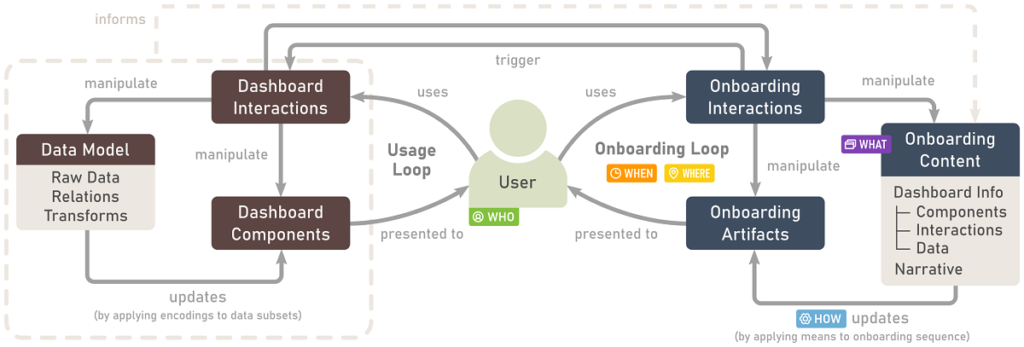
A Process Model for Dashboard Onboarding

Vaishali Dhanoa, Conny Walchshofer, Andreas Hinterreiter, Holger Stitz, Eduard Groeller, Marc Streit. Computer Graphics Forum (EuroVis '22), 41(3), pp. 501-513, 2021.

Abstract

Dashboards are used ubiquitously to gain and present insights into data by means of interactive visualizations. To bridge the gap between non-expert dashboard users and potentially complex datasets and/or visualizations, a variety of onboarding strategies are employed, including videos, narration, and interactive tutorials.

We propose a process model for dashboard onboarding which formalizes and unifies such diverse onboarding strategies. Our model introduces the onboarding loop alongside the dashboard usage loop. Unpacking the onboarding loop reveals how each onboarding strategy combines selected building blocks of the dashboard with an onboarding narrative. Specific means are applied to this narration sequence for onboarding, which results in onboarding artifacts that are presented to the user via an interface. We concretize these concepts by showing how our process model can be used to describe a selection of real-world onboarding examples. Finally, we discuss how our model can serve as an actionable blueprint for developing new onboarding systems.

Read more

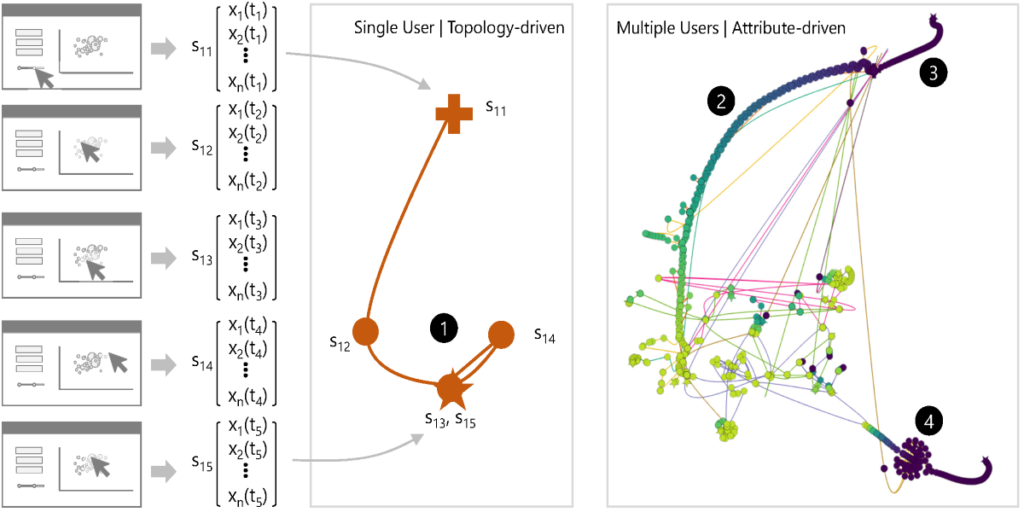
Provectories: Embedding-based Analysis of Interaction Provenance Data

Conny Walchshofer, Andreas Hinterreiter, Kai Xu, Holger Stitz, Marc Streit. IEEE Transactions on Visualization and Computer Graphics, 29(12), pp. 4816-4831, 2020.

Abstract

Understanding user behavior patterns and visual analysis strategies is a long-standing challenge. Existing approaches rely largely on time-consuming manualprocesses such as interviews and the analysis of observational data.

While it is technically possible to capture a history of user interactions and application states, it remains difficult to extract and describe analysis strategies based on interaction provenance. In this paper, we propose a novel visual approach to meta-analysis of interaction provenance. We capture single and multiple user sessions as graphs of high-dimensional application states. Our meta-analysis is based on two different types of two-dimensional embeddings of these high-dimensional states: layouts based on (i) topology and (ii) attribute similarity. We applied these visualization approaches to synthetic and real user provenance data. From our visualizations, we were able to extract patterns for data types and analytical reasoning strategies.

Read more
Path Exploration

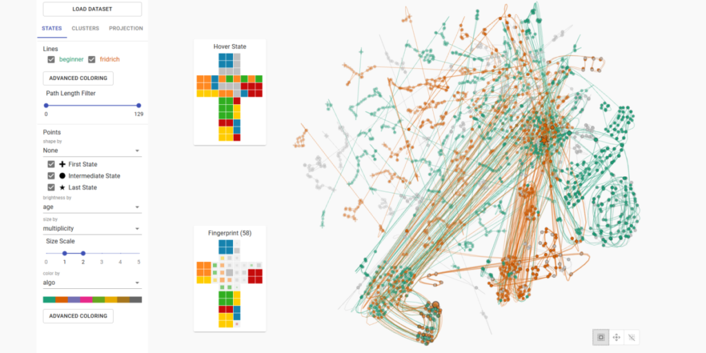
Projection Path Explorer: Exploring Visual Patterns in Projected Decision-Making Paths

Andreas Hinterreiter, Christian A. Steinparz, Moritz Heckmann, Holger Stitz, Marc Streit. ACM Transactions on Interactive Intelligent Systems, 11(3–4): Article 22, 2021.

Abstract

In problem-solving, a path towards solutions can be viewed as a sequence of decisions. The decisions, made by humans or computers, describe a trajectory through a high-dimensional representation space of the problem.

By means of dimensionality reduction, these trajectories can be visualized in lower-dimensional space. Such embedded trajectories have previously been applied to a wide variety of data, but analysis has focused almost exclusively on the self-similarity of single trajectories. In contrast, we describe patterns emerging from drawing many trajectories—for different initial conditions, end states, and solution strategies—in the same embedding space. We argue that general statements about the problem-solving tasks and solving strategies can be made by interpreting these patterns. We explore and characterize such patterns in trajectories resulting from human and machine-made decisions in a variety of application domains: logic puzzles (Rubik’s cube), strategy games (chess), and optimization problems (neural network training). We also discuss the importance of suitably chosen representation spaces and similarity metrics for the embedding.

Read more
Infovis

Taggle: Combining Overview and Details in Tabular Data Visualizations

Katarina Furmanova, Samuel Gratzl, Holger Stitz, Thomas Zichner, Miroslava Jaresova, Martin Ennemoser, Alexander Lex, Marc Streit. Information Visualization, 19(2), pp. 114-136, 2019.

Abstract

Most tabular data visualization techniques focus on overviews, yet many practical analysis tasks are concerned with investigating individual items of interest.

At the same time, relating an item to the rest of a potentially large table is important. In this work we present Taggle, a tabular visualization technique for exploring and presenting large and complex tables. Taggle takes an item-centric, spreadsheet-like approach, visualizing each row in the source data individually using visual encodings for the cells. At the same time, Taggle introduces data-driven aggregation of data subsets. The aggregation strategy is complemented by interaction methods tailored to answer specific analysis questions, such as sorting based on multiple columns and rich data selection and filtering capabilities. We demonstrate Taggle using a case study conducted by a domain expert on complex genomics data analysis for the purpose of drug discovery.

Read more
Tourdino

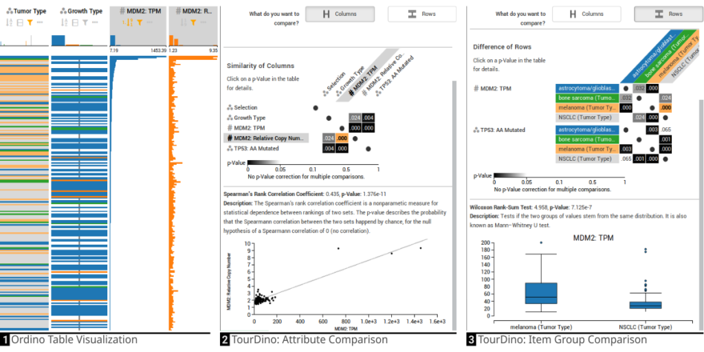
TourDino: A Support View for Confirming Patterns in Tabular Data

Klaus Eckelt, Patrick Adelberger, Thomas Zichner, Andreas Wernitznig, Marc Streit. EuroVis Workshop on Visual Analytics (EuroVA '19), 2019.

Abstract

Seeking relationships and patterns in tabular data is a common data exploration task. To confirm hypotheses that are based on visual patterns observed during exploratory data analysis, users need to be able to quickly compare data subsets, and get further information on the significance of the result and the statistical test applied.

Existing tools, however, either focus on the comparison of a single data type, such as comparing numerical attributes only, or provide little or no statistical evaluation to assess a hypothesis. To fill this gap, we present TourDino, a support view that helps users who are not experts in statistics to verify generated hypotheses and confirm insights gained during the exploration of tabular data. In TourDino we present an overview of the statistical significance of various row or column comparisons. On demand, we show further details, including the test score, a textual description, and a detail visualization explaining the results. To demonstrate the efficacy of our approach, we have integrated TourDino in the Ordino drug discovery platform for the purpose of identifying new drug targets.

Read more

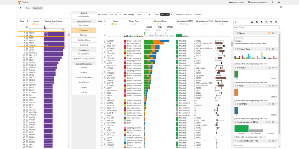
Ordino: visual analysis tool for ranking and exploring genes, cell lines, and tissue samples

Marc Streit, Samuel Gratzl, Holger Stitz, Andreas Wernitznig, Thomas Zichner, Christian Haslinger. Bioinformatics, 35(17), pp. 3140-3142, 2019.

Abstract

Summary: Ordino is a web-based analysis tool for cancer genomics that allows users to flexibly rank, filter and explore genes, cell lines and tissue samples based on pre-loaded data, including The Cancer Genome Atlas, the Cancer Cell Line Encyclopedia and manually uploaded information.

Interactive tabular data visualization that facilitates the user-driven prioritization process forms a core component of Ordino. Detail views of selected items complement the exploration. Findings can be stored, shared and reproduced via the integrated session management.

Read more
Knowledge Pearl

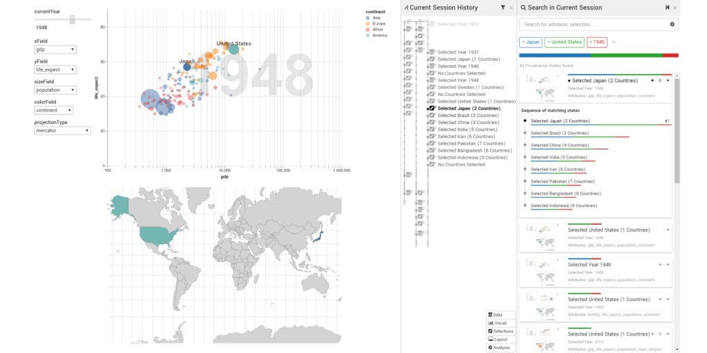
KnowledgePearls: Provenance-Based Visualization Retrieval

Holger Stritz, Samuel Gratzl, Harald Piringer, Thomas Zichner, Marc Streit . IEEE Transactions on Visualization and Computer Graphics (VAST '18), 25(1), pp. 120-130, 2018.

Abstract

Storing analytical provenance generates a knowledge base with a large potential for recalling previous results and guiding users in future analyses.

However, without extensive manual creation of meta information and annotations by the users, search and retrieval of analysis states can become tedious. We present KnowledgePearls, a solution for efficient retrieval of analysis states that are structured as provenance graphs containing automatically recorded user interactions and visualizations. As a core component, we describe a visual interface for querying and exploring analysis states based on their similarity to a partial definition of a requested analysis state. Depending on the use case, this definition may be provided explicitly by the user by formulating a search query or inferred from given reference states. We explain our approach using the example of efficient retrieval of demographic analyses by Hans Rosling and discuss our implementation for a fast look-up of previous states. Our approach is independent of the underlying visualization framework. We discuss the applicability for visualizations which are based on the declarative grammar Vega and we use a Vega-based implementation of Gapminder as guiding example. We additionally present a biomedical case study to illustrate how KnowledgePearls facilitates the exploration process by recalling states from earlier analyses.

Read more
Storytelling

From Visual Exploration to Storytelling and Back Again

Samuel Gratzl, Alexander Lex, Nils Gehlenborg, Nicola Cosgrove, Marc Streit. Computer Graphics Forum (EuroVis '16), 35(3), pp. 491-500, 2016.

Abstract

The primary goal of visual data exploration tools is to enable the discovery of new insights. To justify and reproduce insights, the discovery process needs to be documented and communicated.

A common approach to documenting and presenting findings is to capture visualizations as images or videos. Images, however, are insufficient for telling the story of a visual discovery, as they lack full provenance information and context. Videos are difficult to produce and edit, particularly due to the non-linear nature of the exploratory process. Most importantly, however, neither approach provides the opportunity to return to any point in the exploration in order to review the state of the visualization in detail or to conduct additional analyses. In this paper we present CLUE (Capture, Label, Understand, Explain), a model that tightly integrates data exploration and presentation of discoveries. Based on provenance data captured during the exploration process, users can extract key steps, add annotations, and author ‘Vistories’, visual stories based on the history of the exploration. These Vistories can be shared for others to view, but also to retrace and extend the original analysis. We discuss how the CLUE approach can be integrated into visualization tools and provide a prototype implementation. Finally, we demonstrate the general applicability of the model in two usage scenarios: a Gapminder-inspired visualization to explore public health data and an example from molecular biology that illustrates how Vistories could be used in scientific journals.

Read more
Domino

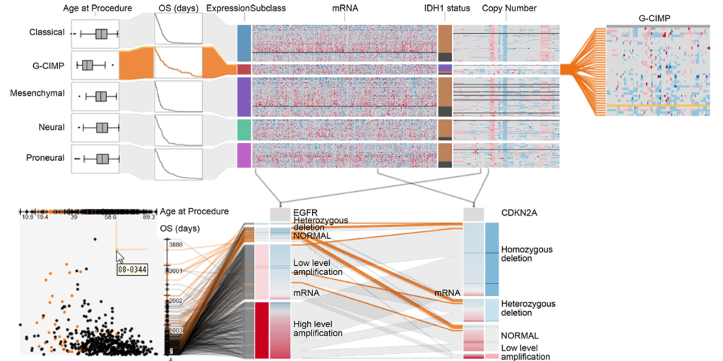
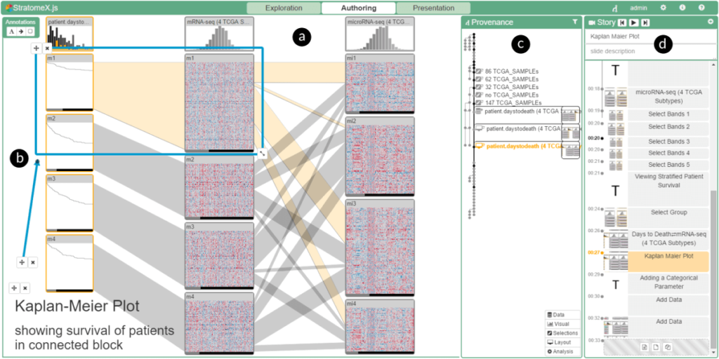
Domino: Extracting, Comparing, and Manipulating Subsets across Multiple Tabular Datasets

Samuel Gratzl, Nils Gehlenborg, Alexander Lex, Hanspeter Pfister, Marc Streit. Graphics (InfoVis '14), 20(12), pp. 2023-2032, 2014.

Abstract

Answering questions about complex issues often requires analysts to take into account information contained in multiple interconnected datasets.

A common strategy in analyzing and visualizing large and heterogeneous data is dividing it into meaningful subsets. Interesting subsets can then be selected and the associated data and the relationships between the subsets visualized. However, neither the extraction and manipulation nor the comparison of subsets is well supported by state-of-the-art techniques.

In this paper we present Domino, a novel multiform visualization technique for effectively representing subsets and the relationships between them. By providing comprehensive tools to arrange, combine, and extract subsets, Domino allows users to create both common visualization techniques and advanced visualizations tailored to specific use cases. In addition to the novel technique, we present an implementation that enables analysts to manage the wide range of options that our approach offers. Innovative interactive features such as placeholders and live previews support rapid creation of complex analysis setups. We introduce the technique and the implementation using a simple example and demonstrate scalability and effectiveness in a use case from the field of cancer genomics.

Read more
LineUp

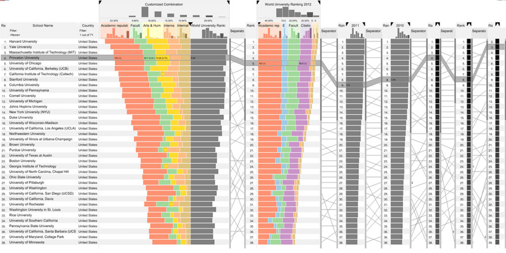
LineUp: Visual Analysis of Multi-Attribute Rankings 

Samuel Gratzl, Alexander Lex, Nils Gehlenborg, Hanspeter Pfister, Marc Streit. IEEE Transactions on Visualization and Computer Graphics (InfoVis '13), 19(12), pp. 2277-2286, 2013.

Abstract

Rankings are a popular and universal approach to structuring otherwise unorganized collections of items by computing a rank for each item based on the value of one or more of its attributes.

This allows us, for example, to prioritize tasks or to evaluate the performance of products relative to each other. While the visualization of a ranking itself is straightforward, its interpretation is not, because the rank of an item represents only a summary of a potentially complicated relationship between its attributes and those of the other items. It is also common that alternative rankings exist which need to be compared and analyzed to gain insight into how multiple heterogeneous attributes affect the rankings. Advanced visual exploration tools are needed to make this process efficient. In this paper we present a comprehensive analysis of requirements for the visualization of multi-attribute rankings. Based on these considerations, we propose LineUp – a novel and scalable visualization technique that uses bar charts. This interactive technique supports the ranking of items based on multiple heterogeneous attributes with different scales and semantics. It enables users to interactively combine attributes and flexibly refine parameters to explore the effect of changes in the attribute combination. This process can be employed to derive actionable insights as to which attributes of an item need to be modified in order for its rank to change. Additionally, through integration of slope graphs, LineUp can also be used to compare multiple alternative rankings on the same set of items, for example, over time or across different attribute combinations. We evaluate the effectiveness of the proposed multi-attribute visualization technique in a qualitative study. The study shows that users are able to successfully solve complex ranking tasks in a short period of time.

Read more

Funded Research Projects

ReproVisyn

Partners:

datavisyn GmbH

Funded by:

Austrian Research Promotion Agency (FFG)

Website:

Goal:

The pharmaceutical industry is in a reproducibility crisis. Articles from the science magazines Science and Nature prove that only a part of the results of the current publications on the subject of cancer research are understandable. At the same time, the industry is in an efficiency crisis: only 5 out of 5,000 so-called drug candidates make it to approval. The drop-out rate contributes significantly to the enormous development costs (1-3 billion USD) and duration (up to 10 years). Many of these drop-out candidates could already be recognized in the first phase of drug development: in the drug target discovery phase. In this project, systems specially tailored to biomedical research are being developed with fully integrated provenance tracking, structured validation of research results, cutting-edge visual analytics and domain-specific support. In this way, the drug target discovery phase can be designed much more efficiently and the quality of the drug candidates can be increased.

Self-Explanatory Visual Analytics for Data-Driven Insight Discovery (SEVA)

Partners:

Fachhochschule St. Pölten, Landsiedl Popper OG, Technische Universität Wien, FH JOANNEUM Gesellschaft mbH

Funded by:

Austrian Research Promotion Agency (FFG)

Website:

Goal:

SEVA aims to help people quickly learn new tools for visual data analysis. The project’s goal is to develop automatically generated onboarding methods for visual analysis systems. Appropriate onboarding methods improve the user experience and the understanding of visual data analysis tools for large and complex data sets. Proof-of-concept prototypes are methodically designed, built, and evaluated along with an iterative, user- and problem-oriented research process.